Understanding the OrdinalPanelData Service
A short explanation of how our algorithm processes and visualizes ordinal panel data.
Ordinel panel data
Panel data (also known as longitudinal or cross sectional time-series data) is a dataset in which behavior of entities is observed across time. The data being observed with our tool consists of subjects that are being classified into linearly ordered classes with a series of tests, which occur at the same time for each of the subjects.
Due to its' characteristics, such data is also known as ordinal panel data.
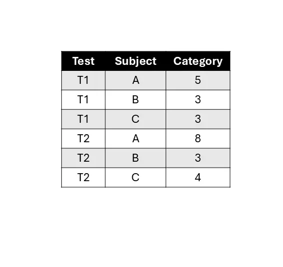
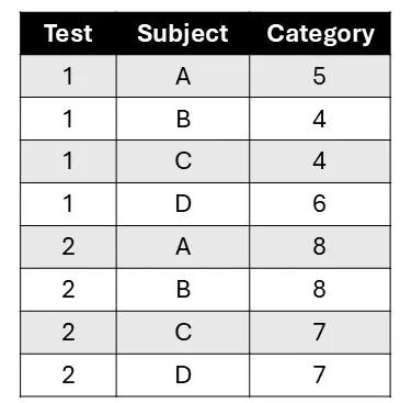
Excel sheet, used to present ordinal panel data, contains three columns such that each represents one of the attributes: the subject being tested, the test to which the subjects were exposed, or the category into which the test classified the subject. For our algorithm, the categories should be represented with discrete numbers, such that each number used represents exactly one category and the linear order of the numbers represents the linear order of categories. This is why we focus on ordinal panel data.
During each test, a category is ascribed to each individual subject, resulting in each row representing a subject and its' sorting during a particular test. If on any test a certain subject fails to be sorted (eg. if it hadn't been tested or the data is missing), the category for 'no data' should be recorded and used consistently for any and all of the subjects it might apply to.
After the input data is processed with our crossing minimization algorithm, the result is sent to the person submitting the data as a pdf file using the previously specified e-mail address.
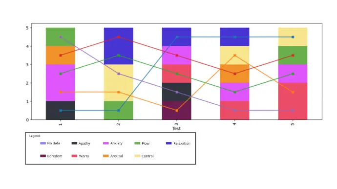
The key content of the file is a graph, produced by our algorithm that takes a described dataframe and creates a drawing that respects the linear ordering of the categories and has the smallest number of crossings between the curves representing the subjects' journey through the categories assigned at all the tests they were subjected to . The algorithm is based on the theory of tiles as described in [1].
The drawing, produced by our algorithm, consists of a barchart showing the fraction of subjects in each category at each test, and one line for each individual subject that connects the points within the category bar chart representing that subject.
As a result, the subjects are ranked at each test even within their categories, so that the ranking within each test minimizes the total number of crossings within the overall drawing, meaning the produced rankings at each test minimize the total number of rank changes that still respects the category ranking at each test. These rankings are discussed in [2.]
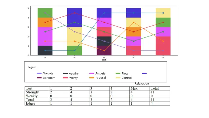
In the paper [1] we define, among other things, weakly forced and strongly forced crossings. The algorithm counts weakly and strongly forced crossings for each test and presents them in a table, included in the pdf below the total number of crossings in each test and the number of edges (again, per test) that would have to be deleted in order to get rid of all the remaining crossings. The latter is obtained using a greedy algorithm and may not be the smallest, but is always an upper bound to the smallest number of edges to be removed to eliminate all the crossings.
Bibliography:
- JEREBIC, J. KAJZER, S. VOGRINEC, M. BOKAL, D. Longitudinal dynamics between linearly ordered classes. V: DROBNE, Samo (ur.), et al. SOR '21 proceedings : the 16th International Symposium on Operational Research in Slovenia : September 22 - 24, 2021, online. Ljubljana: Slovenian Society Informatika, Section for Operational Research. 2021, web: http://fgg-web.fgg.uni-lj.si/~/sdrobne/sor/SOR'21%20-%20Proceedings.pdf
- Paper in preparation